Devlog 1: Identity
Hi everyone! This week I have been focusing on finding an visual style and presentation for my game.
---- TileTales ----
If you've noticed, this project page have a proper name now! TileTales is what I have settled on for this project.
I haved poundered this question for quite a while after I've started to restart this project after uni. Because I have a narrative for my game, I started with that for brainstorming this name. I've considered elements like dragon, prophecy, fortune. But a lot of them gives this connotation of an epic RPG game which is not this game. I also looked at other match 3 games like Bejewled and Candy Crush. They are usually more straightforward and catchy, with a hint of the nature of the game. By this time I've had a list of words on my sketchbook and I'm putting random words together and see if I can get it to sound catchy by either start or end similarly. Tile tales immediated captivated me because I would consider this as a funny pun (you know..), and it includes a hint towards both the narrative and the gameplay.
Because this is for my mum, so for the first time I needed a Mandarin localisation for my project as this is the only language she speaks. So I need a Mandarin name on top of the English one.
This turns out to be a massive test to my Mandarin skill because I haven't had the need to use it apart from casual chats (with my mum) and social medias for a long time so my vocabulary is getting quite rusty :(. I started by applying the same princaple that have led to TileTales. I've had ideas like 转块传 (tales of switching tiles) as it is a closer translation to the English name and both 转 and 传 looks and sounds similar so it imitate how TileTales is structured.
I knew I needed more opinion on this so I brought this to my friends and all of them disageed with this name. All of them have suggested that I need a name that includes Match 3 (消消乐) to indicated what the game is. I know it is a genre convention thing because all the games that I have heard of that are commercially successful have followed this naming convention. But I know I wanted this to be something different than the commercial productions, which is why this is a city buiding genre smash. Luckily some of the chitchat with my friends have inspired the current name I've landed on.
I went with 积财消灾 with the Mandarin name. It means accumulating a fortune to avoid a disaster. This is derived from a saying 破财消灾 (losing money unintentionally means it protected you from a disaster), and by changing one word, I flipped the meaning of this saying, emphasising on how as a player you can take action to change your fate. This name also hints at the mechanics with 积 (resource gathering) and 消 (matching tiles). Obviously this name have no connection to the English version anymore and if this is an translation attempt, it is definitely not a good one. But I think as the developer I have the small privilege to name the project in both language I speak as I see fit.
---- Font Choice ----

I've done some typography work in English before for other game projects and graphic design in general, but it's my first for CJK characters and they are quite different from each other. I decided to start with the English version first.
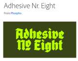
This font is my first inspiration. I found this on Adobe font searching for blackletter. It's giving that medieval vibe with how the bowls are treated and contrast between the stroke thickness, but it's not overly fancy and decorated. So I started with that for both version of the title. The Chinese characters have more curved strikes than closed bowls which brings a different characteristic to the look of the designs. It is something that I have to work with and I realised that I needed something else to make them more similar to each other in design. I ended up bringing in 2 more intentional elements to the titles: top alignment and end of stroke treatment. The top alignment happened to the English version with the "T"s as a nice way to bring all the letters together, which I can carry into the Chinese version as a design choise as naturally the different parts of characters are central aligned and as blocky as they can for visual balance. The end of vertical stroke treatment is inspired by observations from other blackletter and I adapted it to a more decorative element to bring both designes together.
I also picked 2 fonts for each language, one for headings and one for body.
The headings are slightly more decorative with a strong contract between strokes, and the body texts are more standard serif fonts for higher legibility.
---- Visual Narrative ----
This is not a historically accurate game at all and even though I am trying to have a rough narrative for the game, it's more about leading the player journey rather than actual world setting. But I still wanted a clearer reference point than medieval Europe, so I did some history research and went with 10th century Byzantine. I don’t think there was any particular reason for that decision apart from that it looks interesting and quite unusual for games. I have gathered a moodboard but for this devlog I’m only going to go through the key ones.
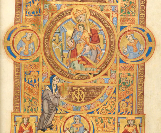
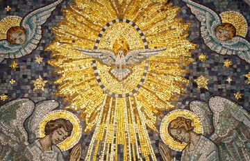
Byzantine arts, like a lot of other art in that area, are quite religious in nature. They used “icons” for their symbolised meanings, and often have texts accompanying them to make sure the message is clear. Patterns and geometric shapes are heavily used that creates a bold and maximalism design.
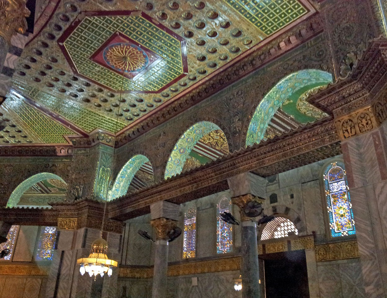
The architecture has a very similar style with arches and pillars for a strong shape. The walls are decorated with patterns.
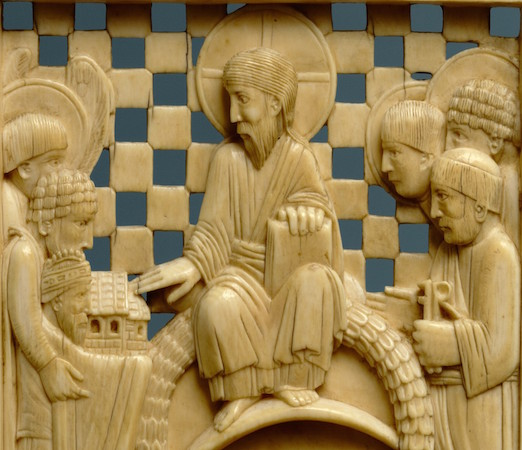
Marble is commonly used in a lot of their artworks. This one have checkerboard background and carved figures that gives it lighting and shadows while till relatively flat. This should go will with how the currently match 3 visual is set up.
I wanted to use mosaic art in this project as it is very iconic art form around that period. But it would be quite the challenge to add in that texture while keeping it intentional and coherent with the graphic itself. So this idea is benched till I have a first version of game build with proper visuals.
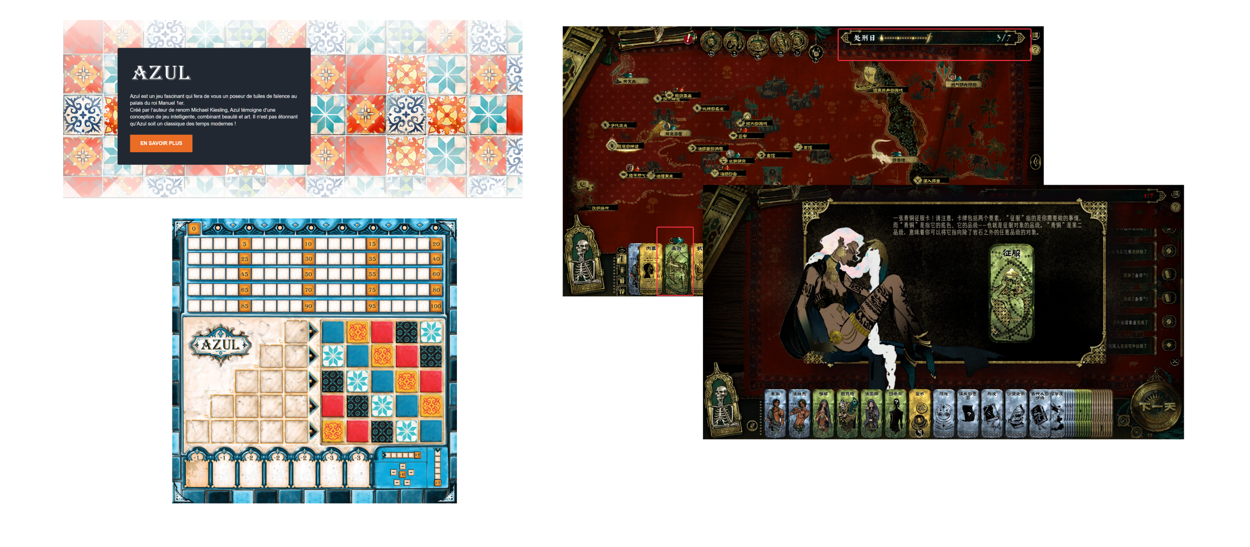
I also looked at other games with similar style to see how people are using these elements in their design. Azul is famous for its bright colour and patterned tiles. To keep it not overwhelming, they have a main colour palette for frames and other gameplay elements, and then tiles that complement the main colours. And within the tiles, the colours always have similar hue, so it doesn’t create more contrast than what’s necessary. Sultan’s game used a lot of textures in all types of backgrounds and on top of the frames that are already designed with lots of patterns. The frames have more decorations in the corners, which I assume is for easy tiling and stretching.
---- Visual language ----
If you’ve seen my other projects, you can probably guess that my usual preferred style is more minimalism, so after I’ve gathered my moodboard and started to design my own I was a bit clueless.
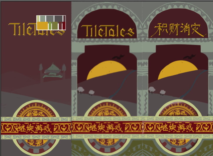
I decided to make a mockup start menu and I knew I need a title, a couple buttons and a background. After some struggle I made the first version. I had to turn my canvas to greyscale to cut down what I need to process but luckily the colour palette I was colour picking from worked quite well with this method so I did not end up with a disaster. But it was very boring and looks like it’s missing something. I brought this to a friend, who is also a fantastic UI and graphic designer (check out their game here), and they suggested that I should use a frame for the background, and that mine currently are too muddy and need a bit more value difference. I am quite stubborn about having some sort of environment in the background but also wanted to take these suggestion onboard, so I had this idea of looking out of a building through a frame. I took reference from the architecture and added a frame, and redid the background image with higher contrast and a focus point. It added a lot of depth to the design and brough all the elements together, which you can see in the second version. Form graphic design perspective this should be a good enough starting point already, but for UI, i still needed something to tell the player what is interactable. Because this whole design, while having a sense of depth, is still quite flat, so I think giving the buttons a 3D form would be a good indicator that it is interactable without breaking the current design.
I will be keeping it updated on bluesky too! You can find me at @mallymiao.bsky.social. Or follow me if you are interested in how this project will go next :D
Comments
Log in with itch.io to leave a comment.
How much support do you intend to provide for both English and Mandarin languages in your game? Will there be any other differences other than text
that's basically it? i do also intend to swap out how some of the buttons are designed if possible